Demand Curve: How to double conversions on your startup’s homepage

Between our work at Demand Curve and our agency, Bell Curve, we’ve rewritten over 1,000 websites for startups across most industries.
Want to convert twice as many visitors into customers? Follow these copywriting tactics.
Everything “above the fold” must have a purpose
The section of your homepage that’s immediately visible to a visitor before they start scrolling is called “above the fold.” (Think of a print newspaper: Everything above the literal fold in the paper is the most important information.) When a visitor sees the content above the fold, they decide to either keep scrolling or exit your site.
In seconds, they’re trying to figure out what you do and whether you’re a fit for them.
The most common mistake we see startups make? Their “above the fold” is either uninteresting or confusing. This often happens when marketers attempt to squeeze too much content above the fold.
The most common mistake we see startups make? Their “above the fold” is either uninteresting or confusing.
The truth is, most of the information on your website is irrelevant to new visitors. So the area above the fold should be used to explain how you can help new visitors solve a specific problem.
For example, you might see a homepage that promotes the newest technical blog post that the company published. But that’s not useful to a visitor who doesn’t yet understand what you do.
To further confuse the visitor, many companies add an extensive navigation bar to the top of their site. In theory, this allows your visitors to easily access any part of your website. In practice, it leads to decision fatigue and low conversion rates.
Unless the content directly helps answer what you do and whether you’re a good fit for that visitor, it should be removed.
There are three things you can do to improve the conversion rate of your homepage:
- Craft a sharp header.
- Use a complementary subheader.
- Design with intention.
Let’s get into the tactics of these three areas of improvement.
Help TechCrunch find the best growth marketers for startups.
Provide a recommendation in this quick survey and we’ll share the results with everybody.
Write headers that speak to an individual (not a crowd)
Your header is the largest piece of text on your website. In under 10 words (about the longest we’d recommend), your header needs to accomplish three things:
1. Identify how customers get value from your product.
This is your most important value proposition. If you can’t explain how someone gets value from your product in fewer than 10 words, it’ll be a challenge to keep visitors’ attention for much longer.
Here’s how we uncover your key value proposition:
- What bad alternative do people resort to when they lack your product?
- How is your product better than the bad alternative?
- Now turn the last step into an action statement — that’s your value proposition.
Take Airbnb:
- The bad alternative is being stuck in a sterile hotel without experiencing any real culture.
- Airbnb’s product is better than the bad alternative because it allows you to stay in a local’s home.
- So if we turn the second question into an action statement, we’d get a value proposition like: Experience new cities like a local.
Here are some more examples from top startups:
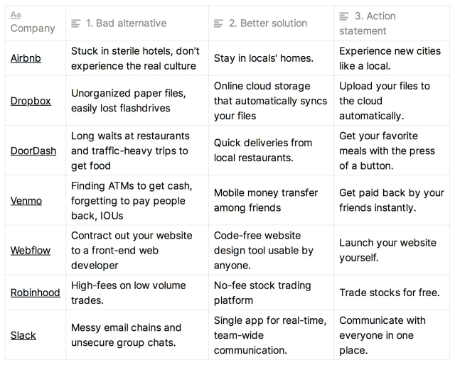
Image Credits: Demand Curve
2. Include an enticing hook that keeps visitors reading.
Telling your visitors what you do is a good start, but now we need to get them excited about your product.
A huge missed opportunity we see a lot of startups make with their website copy? It’s not action oriented. In a world where customers can shop 24/7, there’s very little urgency for your visitors to take action now.
Adding a hook will increase the likelihood that a visitor buys from you on their first visit.
There are two ways we like to write hooks:
- Offer a bold claim: something highly specific that triggers the thought, “Wow, I didn’t know that was possible.”
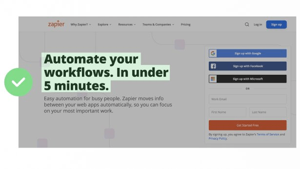
Image Credits: Demand Curve
- Or address common objections: questions or pushback that your visitor is likely already thinking about. Addressing objections right away might seem counterintuitive, but bringing attention to your weaknesses will actually make your visitor trust your brand more. With no direct sales team, your copy is going to need to work hard to answer as many questions as possible.
Here are some value propositions of top startups that incorporate their biggest objections upfront.
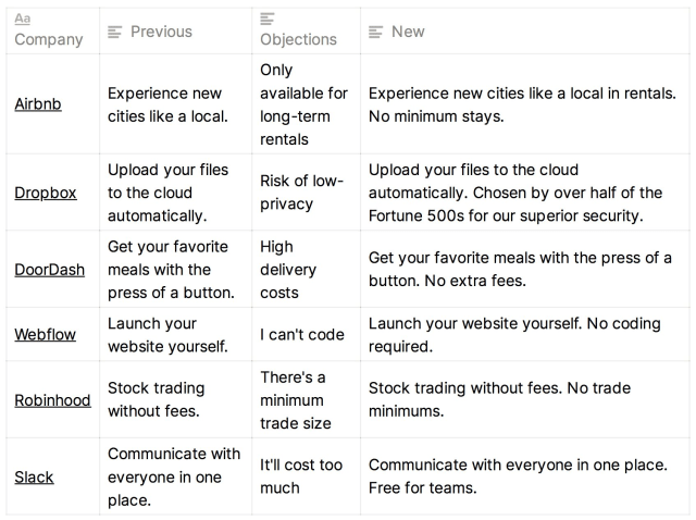
Image Credits: Demand Curve
3. Speak directly to your ideal customer persona
To truly make the message in your header grab the attention of your visitor, rewrite your value proposition to speak directly to your customer personas.
To do so, list your top two to three customer personas. Rewrite your headers to address the part of your product they value most. Use their own language, not industry jargon. The best way to learn what your customers love about your product is through one-on-one customer interviews or reading customer success tickets.
Now you’ve got headers that speak directly to your ideal customer persona. You can either A/B test which header leads to a higher conversion rate or create custom landing pages using each header to drive traffic from different sources to specific pages.
For example, if you include a link to your website in a guest blog post, send that audience to the page with the most relevant header.
Here are some examples of writing multiple value propositions for the same startup:
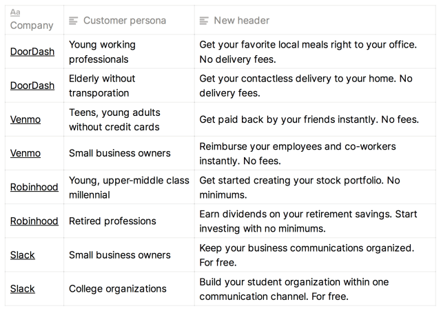
Image Credits: Demand Curve
Use a subheader to explain how your header can be possible
We suggest spending about 50% of your time working on writing the header and 25% of your time on the subheader. Why? Because if your header isn’t interesting, your visitors won’t even bother reading the subheader.
Your subheader should be used to expand on two things:
- How does your product work exactly?
- Which of your features make our header’s bold claim believable?
You can use your top two to three features to explain how your header is achieved.
For example, let’s say Airbnb’s header is: Experience your getaway vacation like a local. No minimum stays.
To make this statement believable, we need to explain how it’s possible to vacation like a local and how “no minimum stays” is possible.
A subheader could read something like: An online rental marketplace with thousands of short-term rentals in your area.
Do not use industry jargon or technical terms in your subheader or header. Use words that a fifth-grade reader would understand. Use short sentences. Lengthy paragraphs will kill the momentum of your reader.
Here are a few more examples of using the subheader to explain the header:
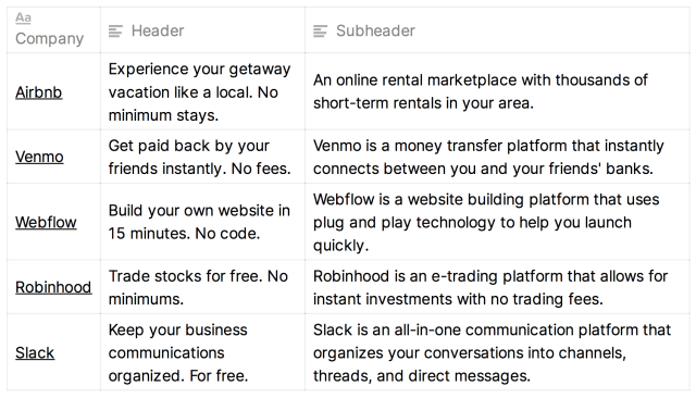
Image Credits: Demand Curve
Make your homepage feel familiar and function as expected
The last aspect to consider when creating a high-converting homepage is the design. We see a lot of high-tech startups try to use their website to show off their creativity.
From our experience, your website is not the place to try to be original.
A website’s design should rarely be unique. It’s your product that should be unique. Your website is just a familiar medium for communicating your product’s uniqueness.
Functionality
Using familiar buttons and navigation that other websites have popularized will save your visitor the hassle of having to learn how your website works. For example, we’ve come to expect there to be a “home” button in the top left of the page. Attempting to place the same button in the bottom right for the sake of uniqueness will lead to confusion and possibly a lost customer. Stick with what works.
Images
Consider these goals when adding images to your homepage:
- Remove uncertainty by showing your product in action. GIFs or looping videos are a terrific way of demonstrating how it works without taking up any additional space.
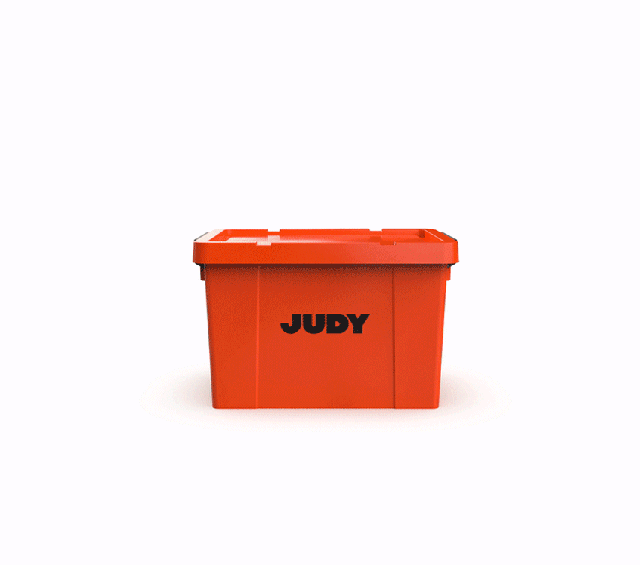
Image Credits: Judy
- If you sell physical goods, use images to show off various use cases and close-ups of the material and texture. This will help your visitor assess the quality of the product and further validate that the product is right for them.
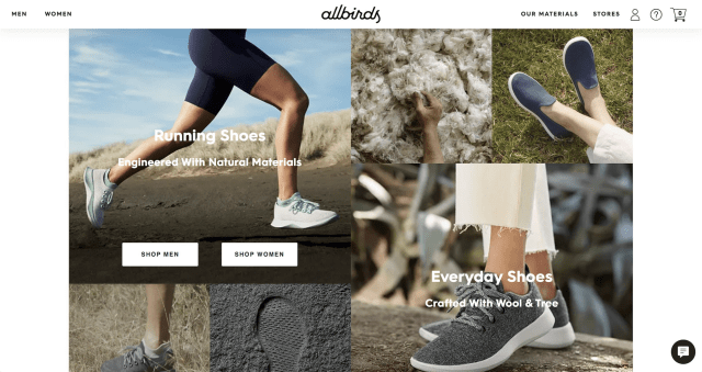
Image Credits: Allbirds
Call-to-action buttons
Your call-to-action buttons (CTA) are where you’ll convert a visitor of your webpage into an active shopper. Therefore, your CTAs should be a continuation of the magic that you teased in your header copy.
Make the CTA button copy action focused and tell your visitor what will happen once they click it.
Here are some examples of CTA buttons that feel natural because they continue the narrative that began with the header copy:
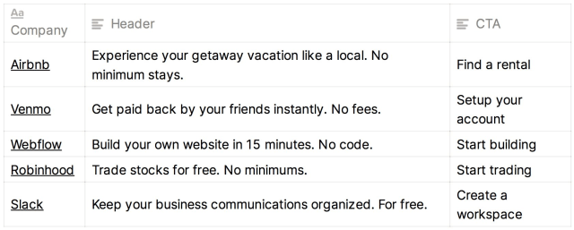
Image Credits: Demand Curve
Nick Costelloe Contributor Nick writes actionable growth marketing insights as head of content at Demand Curve. More posts by this contributor Demand Curve: 10 lies you’ve been told about marketing Between our work at Demand Curve and our agency, Bell Curve, we’ve rewritten over 1,000 websites for startups across most…
